For decades, the “safe” choice in home design has been a sea of beige, oatmeal, and “builder grade” white. While neutrals certainly have their place in creating a clean slate, the modern homeowner is increasingly looking for something more—a way to express personality, evoke specific emotions, and create a sanctuary that feels truly unique. We are currently witnessing a massive shift in interior design: the departure from sterile minimalism in favor of “dopamine decor” and “biophilic design,” where the colors we choose are intended to make us feel more connected to nature and our own joy.
The Rise of Earthy Sophistication
The “new neutrals” are a far cry from the flat tans of the past. Today’s sophisticated palettes are rooted deeply in the earth, drawing inspiration from raw minerals and organic clay.
Think terracotta, warm ochre, and muted sage. These colors provide a sense of grounding and stability that stark whites simply cannot offer.
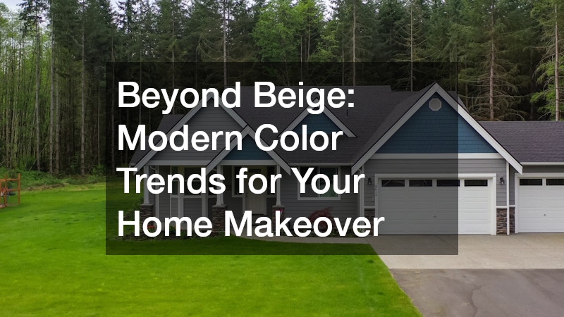
Terracotta, in particular, has seen a massive resurgence. It brings a Mediterranean warmth to a space without the aggressive energy of a bright red or primary orange. When paired with natural wood textures, matte black fixtures, and linen fabrics, it creates a “quiet luxury” aesthetic that feels both timeless and trendy. Sage green acts as a bridge between the indoors and outdoors, making it a favorite for those who want their home to feel like a tranquil garden retreat.
Moody Hues and Dark Academia
While common areas like living rooms are leaning toward warmth, private spaces like bedrooms, dens, and home libraries are becoming havens for drama. Deep, saturated tones like navy blue, charcoal, and even “forest black” are trending. These colors create a cocoon-like effect that is incredibly soothing for rest and focus.
The key to pulling off dark colors is managing lighting and contrast. By painting the walls a deep navy and keeping the ceiling a crisp white or a soft cream, you maintain a sense of height while enjoying the intimacy of the dark walls. This “moody” trend often overlaps with the Dark Academia aesthetic—think leather books, brass accents, and velvet furniture.
It’s a bold move that many homeowners are hesitant to try themselves because dark pigments are notoriously difficult to apply evenly. When you are ready to make a significant leap into these darker palettes, consulting with local painting contractors can be invaluable. These professionals understand how different finishes—such as matte versus satin—interact with deep pigments, ensuring that your dark walls look rich and velvety rather than patchy or overwhelming.
The Return of “Jewel Box” Rooms
While open-concept living remains popular, there is a growing trend toward “jewel box” rooms. These are small, enclosed spaces—like powder rooms, laundry rooms, or walk-in pantries—where you can take massive color risks. Since these rooms aren’t occupied for long periods, you can afford to be experimental without the fear of “color fatigue.”
Vibrant emerald greens, deep amethysts, and even glossy bordeaux are taking center stage in these smaller zones. In a jewel box room, the goal is total immersion. This often involves “color drenching,” a technique where the walls, trim, doors, and sometimes even the ceiling are painted the same shade. This eliminates visual clutter and makes a small room feel intentionally designed rather than cramped.
Biophilic Blues and Greens
Our collective desire to be closer to nature hasn’t faded; it has evolved. We are seeing a shift toward “watery” blues—colors that remind us of the ocean, a misty morning, or rain-washed slate. These shades are replacing the cold “Millennial Gray” that dominated the last decade. They are versatile, calming, and pair exceptionally well with the light oak and rattan furniture that is currently popular.
Greens are also becoming more complex. Instead of the bright “apple green” of years past, we are seeing olive, moss, and eucalyptus tones. These colors feel historic and established. They give a home a sense of heritage, even if it was built only a few years ago. Because green is a color the human eye is naturally accustomed to seeing in abundance, it is one of the easiest colors to live with over long periods of time.
Execution and the Professional Touch
Choosing the right color is only half the battle; the execution determines the final “vibe” of the home. Modern colors, especially those with high pigment loads or unique lime-wash finishes, require meticulous surface preparation. Any imperfection in the drywall—a poorly patched nail hole or a slight texture mismatch—will be magnified by a deep blue or a trendy dark green.
This is why many people choose to outsource the heavy lifting. Reaching out to local painting contractors ensures that the technical aspects—sanding, priming, and achieving those razor-sharp clean lines at the ceiling—are handled with precision.
Beyond the labor, professionals can provide insight into “metamerism”—the way a specific color reacts to your home’s unique lighting. A color that looks like a soft, dusty rose in the showroom might look like a muddy brown in a north-facing room with little natural light. Professionals can help navigate these nuances, saving you from the “oops” gallon of paint that so many DIYers end up with.
Moving beyond beige is an act of reclamation. It is about reclaiming your home as a space of personal expression rather than a generic asset for future resale. Whether you choose the grounding warmth of terracotta, the dramatic depth of charcoal, or the refreshing calm of a misty blue, your home should tell a story that belongs to you. With the right vision and the help of skilled local painting contractors, you can turn your next makeover into a masterpiece that resonates with your personality and stands the test of time.